SecureOT
Client: Moveo Group |
Roll: Lead designer |
By: Moveo Group |


Intro:
An Israeli IoT cybersecurity startup needed a brand refresh and stronger digital presence. We designed a homepage to reflect its updated vision and potential.
ORIGINAG LOGO:
Brief
Developing a strong digital presence for SecureoT with a clear, innovative brand language that highlights its IoT and cloud security advantages, effectively showcasing its value to target audiences.
SecureoT targets tech-oriented B2B(2C) clients, including security experts, IoT developers, DevOps etc. seeking an advanced solution.

Process
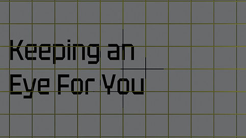
Keeping an eye for you
Creative:
In a digital world full of risks, SecureoT aims to be the "ride-or-die" friend. While our customers dream of innovation, we keep an eye on the threats for them!
Tone:
Genuine & trustworthy.
Brand promise:
“Keeping an eye for you”
Recognizing that our customers are protective of their own security and care deeply about safeguarding their clients.
SecureoT’s new design uses protective, warning colors.
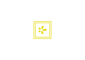
Robotic eye logo, vigilance and security.
Secondary colors
Final logo


Design:
Main colors
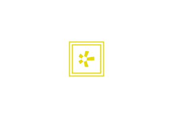
The double-box design suggests impenetrability
Typography

Slightly geeky font feels trustworthy (cyberspace)

A stable and serious, running text.


Solution
Approach:
The homepage features a video introduction with the brand slogan.
The logo is thoughtfully embedded in micro-interactions to boost brand recall.